WeвҖҷve all experienced information overload. Slides that are just too dense. Web pages with no clear call to action. Forms with too many options.
вҖңIf everything looks the same, then you see nothing,вҖқ explains Miguel Cardona, Designer Advocate at Figma. "Visual hierarchy can change that."
What is visual hierarchy?
Visual hierarchy is the practice of arranging elements in order of importance, to direct a userвҖҷs attention to content and tools that can meet their needs. What catches their eye first? Then where do they look? Do users take the action you intended and feel satisfied by the outcome
Done well, visual hierarchy helps people understand information intuitively. ItвҖҷs how audiences can quickly understand from a glance at a movie poster what the movie is about, whoвҖҷs in it, and its release date. Look closer and you might spot less critical information, like its rating and studio affiliation.
7 essential visual hierarchy principles
Visual hierarchy takes inspiration from Gestalt psychology, which explores how the mind creates order out of chaos, makes patterns, and groups separate elements into a unified whole.
Designers apply eight key visual hierarchy principles to help the mind grasp ideas quickly.
1. Alignment refers to the placement of one visual element in relation to the others in a group. When objects are aligned, or lined up, they're understood as related to one another.
2. Color is often described in terms of hue, lightness, and saturation. Color can be tricky, though, because people perceive it so differently. To establish a clear visual hierarchy, Cardona specifies luminance and brilliance in design.
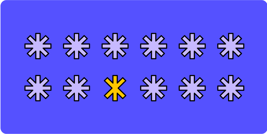
3. Contrast is when notably different elements are close together. Designers often juxtapose warm and cool elements or complementary colors to enhance visual appeal and boost contrast ratios for accessibility.
4. Proximity describes how near or far items are in relation to each other. Grouping or вҖңchunkingвҖқ objects is an example of this principle in action.
5. Size refers to the dimensions of an object or design element. The size of UI elements like buttons or content can be an important consideration for accessibility. вҖңIf you don't provide low-vision users the opportunity to have agency over text and image size, you're making your content difficult to read and understand,вҖқ Cardona says.
6. Texture is the way a surface feels or a UI element is perceived to feel. "Texture allows you to ascribe meaning to design, and may help give a clear visual indication of how something is to be used," says Cardona. When UI designers use texture to mimic the appearance of tactile, real-life material, that's referred to as skeuomorphismвҖ”and it can come across as dated or literal unless handled carefully. "With digital design, a lot of designers avoid textureвҖ”but it can be really impactful,вҖқ Cardona explains. вҖңTexture can be used to create highlights, instead of relying on color."
7. Time unfolds on screens differently than on printed pages and static products. Screens can change, react, and transform, opening up a new world of temporal design.